Modelling the spread of COVID-19

How fast could COVID-19 spread in Australia? And how many people could potentially be infected?
We can’t of course know for sure, but we have enough data to make some rough forecasts; and being forewarned is to be forearmed.
So we’ve developed an interactive website that gives a ten-day forecast, by country, on likely numbers of COVID-19 cases.
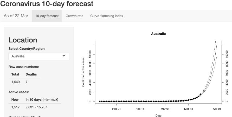
The app’s 10-day forecast for Australia as of 22 March, 2020.
It is designed to give people a sense of how fast this pandemic is progressing, as well as some more information on one of the key uncertainties in the countless media stories covering the issue – the true number of cases.
At the time of writing (22 March), the rough forecast for Australia is sobering and underscores the need for action.
As of March 22, while Australia has 1,517 active cases of COVID-19, if we continue on the same trajectory – the number of confirmed cases may have grown to at least 9,831 in ten days, and perhaps as many as 15,707.
This projection is based on the raw data (the app uses data collated by the team at John Hopkins University in Baltimore, for their excellent global coronavirus tracker) and assumes simply that the number of cases grows at the same rate that it has been growing over the last ten days.
This is what exponential growth looks like.
Australian Government actions like bans on travel, large gatherings and shut downs can be expected to help slow infection rates, and if effective this would be reflected in the subsequent forecasts.
Of course, simply tracking confirmed cases underestimates the actual scale of the problem.
Many more cases of infection will be undetected. This is particularly the case for a virus like COVID-19 where symptoms can be mistaken for a cold or flu. Without massive investment in testing, we will always miss cases.

Reasonable estimates of the number of undetected cases of COVID-19 are important to understand.
It is difficult to estimate the total number of actual cases of COVID-19, but it is important to try to do so. We need to appreciate the potential scale of the pandemic if, as a global community, we are to tackle it effectively.
Accordingly, we have made a rough estimate of the proportion of cases that are being detected in each country so that we can work backwards and generate a figure for total cases.
The method assumes that there is widespread community transmission, that deaths won’t go unnoticed, that the case fatality rate of symptomatic people is about 3.3 per cent and it takes about 17 days for people who are going to die from the virus to pass away.
These numbers come from published analyses of the Wuhan outbreak, and where there is uncertainty we have chosen values that give us a larger detection probability.
Under these assumptions, we can then look at the number of deaths occurring in a five-day period, and estimate the number of infections required to generate these deaths based on a 3.3 per cent fatality rate.
Finally, we can compare that to the number of new cases actually detected in the five-day period 17 days earlier to give us an estimate of the proportion of actual cases that were detected 17 days ago.
This can then give us an estimate of the total number of cases, confirmed and unconfirmed.

The app charts growth rates across different countries. The graph as of 22 March 2020 shows how China appears to be on top of the outbreak, Italy is gradually making progress, and Australia and the US have work to do.
For Australia, at the time of writing, we estimate that the proportion of confirmed cases is around 0.2434. This means the actual number of cases could be as high as 6,233, compared with the 1,549 confirmed.
These numbers need to be taken with a big dose of salt.
For example, in Australia, community transmission only just now looks to be kicking off. We expect the detection rate to increase over time here.
But these numbers do give us a potential indication of the scale of the crisis, both here and in different countries. Low detection is a big issue.
By having at least some sense of the scale of infection we can better choose when to act, and avoid some of the panic that feeds off uncertainty.
The goal of every community in this pandemic should be to flatten the pandemic curve, which means slowing infection rates. This is absolutely critical if we are to ensure that our health systems maintain the capacity to treat patients.
The earlier we act to reduce transmission rates, the more chance we have of avoiding the crisis of an overwhelmed hospital system.
Flattening the curve is a key indication of how well communities are controlling the outbreak. Accordingly, the app includes growth rates over the last ten days and a curve-flattening index so you can see how well your country is doing.
When we look at the growth rates across different countries it becomes clear from the graph above that the measures taken in China and South Korea are working; growth rates are slowing to near zero in South Korea, and are negative in China.
Italy is still struggling valiantly to contain the virus, and growth rates remain alarmingly high in Europe, the US and Australia.

Slowing the growth of infection rates (flattening the curve) is important to stop health services being overwhelmed.
The code for the app is now up on the software development platform, github and freely available for use.
Our aims are: transparency (anyone can see what is going on in the background); community help (people around the world are contributing to improve the app); and facilitation (the code can be used by people looking to develop country-specific apps, for example).
My colleague Assistant Professor Alex Perkin’s group at the University of Notre Dame in Indiana have built a model for the US.
Reassuringly for our model (as of 14 March), our estimate of the number of undiagnosed cases in the US (about 100,000) was very similar to their results.
Other scientists around the world are working hard to build similar tools to help communities and health systems manage this pandemic.
Our website is largely finished now and will automatically update every day without our intervention, but we will continue to work to channel data to better predictive tools currently under development, like for example, this model of spread developed by Dr Alison Hill at Harvard.
We will point people to these tools as they become available.
The bottom line is that without this type of modelling and forecasting people have a hard time grasping the speed with which this pandemic is moving. If we are not prepared it will catch us flat-footed.

The data tells us that measures taken in China and South Korea are working.
By having a reasoned idea of what is in front of us, we can act earlier and avoid a crisis. The fact that other countries are controlling the epidemic through social distancing measures is very encouraging.
This pandemic can be controlled, and the earlier we adapt to its presence the less impact it will have.
Wash your hands, people. And try to stay at home.
Thanks to Dr Matteo Tomasini (Michigan State University) and Professor Daniel Bolnick (University of Connecticut) for helping with the code, data and ideas. This article was published by Pursuit.
Associate Professor Ben Phillips is an Ecologist and Senior Lecturer at the University of Melbourne. He is interested in evolutionary perspectives which could illuminate applied decision making in conservation, agriculture, and population health.